

Section Styles button-center-mobile text-center-mobile
Storytelling with Data: The Complete Guide to Turning Data Into Decisions




Written by Karen Eber, TED speaker (2.25M+ views), bestselling author of The Perfect Story, creator of the Five Factory Settings of the Brain, former Head of Culture and Chief Learning Officer at General Electric, and former Head of Leadership Development at Deloitte.
Organizations have more data than ever. They are data rich and insight poor.
Because of this, they struggle to create a shared understanding with it.
Every day, leaders present dashboards, reports, and analytics filled with accurate information. Yet meetings end without alignment, stakeholders reach different conclusions from the same numbers, and decisions stall.
Slick visuals and charts are shared, but the audience fails to understand or connect with the information. The real gap is in the communication. Numbers don’t create alignment, meaning does.
Storytelling with data helps leaders move beyond reporting information to creating shared understanding.
This guide explores what storytelling with data really is, why it matters more than ever, why it’s challenging, how it differs from data visualization, common misconceptions, and why it has become an essential leadership capability.
Related Reading
Five related articles from Karen’s blog. The full guide continues below.

Why Storytelling With Data Matters
Data never speaks for itself.
Organizations have more data than ever. Every dashboard, report, survey, and AI-generated analysis promises better decisions. Yet more access to information hasn't produced more alignment. The differentiator for leaders and organizations is no longer access to data, it's the ability to create understanding from it.
Too often, presentations overwhelm audiences with charts, tables, and statistics, assuming the numbers will speak for themselves. Data can reveal what's happening, but it rarely explains why it matters or what people should do next.
People filter information through prior experience, attention, and expectation before they ever get to a decision, which is why two people can look at the same chart and walk away with different conclusions. AI has changed this equation rather than settled it: it can generate a report or summarize a trend in seconds, but it can't determine which story a specific audience needs to hear, or how to tell it in a way that builds trust. As data becomes more abundant, the ability to communicate it well becomes the scarcer, more valuable skill.
That's where storytelling with data comes in.

The Problem You Might Not Be Naming
You don’t need a better dashboard. You need better communication.
Most teams don't describe their data problem as a communication problem. They describe it as a literacy problem, "the room just isn't data literate," or a volume problem, "we need a better dashboard."
The real problem sits earlier than the chart that gets debated in a meeting. Organizations have more data than ever and no clear answer for what they're using it to decide. The question gets skipped as teams dive into the analysis. They pull the data, look for compelling charts, and piece together a message that was never built to answer anything or guide anyone. Leaders jump straight to the findings because they never aligned on the question the findings were supposed to answer.
That gap shows up in a few consistent ways:
The purpose gets lost before the analysis starts. Data gets collected without a clear reason driving the collection.
The question never gets defined. Nobody names the specific problem(s) the data is meant to inform before diving in.
The analysis follows the visuals, not the question. Teams gravitate toward whichever chart looks most compelling rather than first answering the problem statements and then deciding if visuals are necessary.
Volume gets mistaken for credibility. More data feels like more rigor, even when none of it is anchored to a decision.
Trust never gets built. The audience is silently asking whether they can trust the data and the person presenting it, long before they evaluate the recommendation itself, and most presentations never address that directly.
Presenters neglect the story. Data points are rattled off, reading what’s on the chart. The presentations lack any context behind what happened, why it happened or what it means.
The presenter stops short of guiding the room. The person closest to the data rarely tells the audience what to do with it, whether that's a discussion, a decision, or something to monitor going forward.
The analysis can be completely correct and still fail, because correctness was never the missing piece. What's missing is a question the data was built to answer, and a presenter willing to guide the room to an outcome once it does.

What is Storytelling With Data?
Not all visuals tell a story. Not all data needs a visual
Storytelling with data is Karen Eber's framework for turning information into a decision. It starts with the question the data is meant to answer, builds the audience's trust in both the analysis and the person presenting it, and communicates it so audiences are informed and can act. Visuals come last, if at all.
Those questions map to three distinct jobs, and most data presentations only do the first one well:
Analysis answers: What happened?
Storytelling answers: Why does it matter?
Leadership answers: What should we do next?
The work that actually determines whether a presentation lands happens before anyone opens a chart. An audience is silently deciding whether they trust the data, whether they trust the person presenting it, and why any of it should matter to them, long before they evaluate a single visual. A chart can display information. It can't build that trust or answer the question no one asked out loud. That's a job for the presenter, not the visualization.
Visuals still matter, but as reinforcement for a story already built, not a substitute for one. A well-designed chart can display a pattern clearly and still leave a room wondering what to do with it.
A well-designed chart can still leave an audience wondering what they're supposed to do with what they just saw. Storytelling is the layer that answers that question.
STORYTELLING WITH DATA
Creates meaning
Focuses on decisions
Begins with the audience
Uses narrative and context
Drives action
DATA VISUALIZATION
Displays information
Focuses on charts
Begins with data
Uses design principles
Is a visual aid to a presentation

Why This Is Hard
There’s a myth that data are facts and rigor and stories are fluff.
But data doesn’t change behavior. Emotions do.
People feel like data = credibility. The more data and analysis you share, the more expertise you must have. People are trained and rewarded for rigor, completeness, and precision. Story can feel like it dilutes the analysis, or worse, that it manipulates it. That instinct is understandable, and it's also exactly what keeps good analysis from becoming a decision.
More data = more data. It doesn’t always equal more insight. Especially when you’ve never defined what questions you are trying to answer.
People are often evaluated on whether the analysis is defensible, not on whether the room understood it. So they share as much data to the point where the audience is overwhelmed and goes quiet. Mingled in here is the fear that if you oversimply things, you’re opening yourself up to debate and questioning. Over-precision because the default habit, even when it costs the room its understanding. Complexity isn’t kind, clarity is.
Who this hits hardest: the analyst who feels unheard after doing the work correctly, and every decision-maker downstream who has to guess at what the numbers mean, and guesses wrong at a rate that rises with how confusing the presentation was.
Why Do People Struggle With Storytelling
After working with executives, analysts, marketers, engineers, and finance leaders across industries, Karen Eber noticed the same patterns repeatedly:
Presenters assume the data speaks for itself. Numbers require interpretation, and without it, an audience is left to supply their own.
They overwhelm people with information. When every metric appears equally important, audiences struggle to determine what actually matters.
They go deep without setting context. Many presentations jump straight into the data, walking through it row by row, instead of first framing the question the data was meant to inform and why it matters. Without that context, the audience never connects to the data enough to find it meaningful.
They bury the recommendation. The audience shouldn't have to guess what decision is being recommended.
They mistake complexity for credibility. Showing more information doesn't make a presentation more persuasive. In many cases, it makes it harder to act on.
None of these are data problems. They're choices about what to say first, and they're entirely fixable once a presenter starts building the story before building the slide.
Why Data Presentations Fail
The room doesn't stop paying attention all at once. It happens in stages. A presentation opens immediately digging into detailed data without context for the audience and they begin to drift. Presenters ramble as the audience thinks, "get to the point." A few slides in, someone interrupts to ask a clarifying question and jump ahead several slides. The conversation splits into side debates about the data's validity instead of what to do about it. The audience is consumed deciding whether to trust the numbers that they miss the explanation.
What was framed as a data presentation becomes a credibility negotiation. Audiences leave uncertain about what to do next. No decisions are made. Follow-up meetings and scheduled to have the same conversation again, this time with two more views of the same dashboard added in.
The presentation didn't fail because the analysis was wrong. It failed because the room was never given a reason to trust it, or a clear place to land once they did.
The Cost of Doing Nothing
Teams spend hours every week rebuilding the same analysis because the first version never landed, without anyone naming what actually went wrong.
The cycle feels like diligence, but it’s organizational waste:
When leaders lose confidence in a presentation, they don't usually name the real problem, that nobody aligned on the question before the analysis started. They ask for more data, slides, validation, and meetings. The rework compounds. Each additional round costs the presenter's credibility a little more and the organization's time a lot more, and the underlying gap, a decision nobody was equipped to make with the information as presented, still never gets closed.
Left unresolved, this pattern doesn't just waste time, it distorts judgment. A leader who never learns to zoom out from a single compelling anecdote can end up making a call the broader data actively contradicts: mandating a return to office because one employee said they're more productive there, or greenlighting a product feature because one customer asked for it, while the data everyone already had said otherwise. The story wasn't wrong. It just was never balanced against scale, because nobody built the habit of asking for it.
And the analysts and teams closest to the data absorb the cost personally. They did the work correctly and still watch it get picked apart, not because the analysis was flawed, but because nobody defined the question it was supposed to answer before they started. Over time, that teaches good analysts to over-prepare, over-hedge, and disengage from the room, the opposite of what the organization needed from them.
Why This Matters More in the Age of AI
AI can’t decide what a room needs to hear and understand
AI has made it dramatically easier to generate a report, a dashboard, or a summary of a trend. Creating genuine understanding from that output still takes exactly the same amount of human judgment it always did, and arguably more, since there's now more generated material competing for a room's attention than ever before.
That shift changes what's actually scarce. Access to analysis is no longer the differentiator, AI can produce it in seconds. What AI can't do is decide which story a specific audience needs to hear, sense what they already believe walking into the room, or build the trust that makes them act on a recommendation rather than debate it. Those are the parts of the work that determine whether a data presentation lands, and they're the parts closest to Karen Eber's approach: the thinking that happens before anyone touches a chart, informed by who's in the room and what they need to decide.
This is also where the distinction between data-driven and data-informed decisions matters more than it used to. AI can generate a recommendation from a dataset in seconds, but a data-driven output still needs a human to determine whether it's the right recommendation for this audience, this moment, and this decision. As AI-generated analysis becomes the default rather than the exception, the leaders who stand out won't be the ones producing the most dashboards. They'll be the ones who can take an AI-generated dashboard and still tell the room what it means and what to do next.
Karen Eber’s Perspective
One of the biggest leadership misconceptions is that better facts produce better decisions.
If that were true, every well-built business case would get approved on the strength of its numbers, every strategy presentation would produce alignment in the room, and every employee would embrace a change the moment they saw the data behind it.
That isn't how people actually process information. People interpret data through the way their brains are wired to work, not through the data alone, which is why two people can look at the same chart and walk away with two different conclusions.
As Karen Eber puts it in her TED Talk on the neuroscience of storytelling, data doesn't change behavior. Emotions do. People connect to information emotionally before they reason their way to a conclusion. There isn’t a battle between telling a story or sharing data. Both are needed to help the audience connect with information so they can take action.
Karen has seen this play out in a specific, recurring form she calls the N of 1 problem: a leader hears one vivid story, a single customer, a single employee, a single data point, and lets it override everything the broader data shows.
It's an understandable instinct. A single story is easy to connect with emotionally, and the brain reaches for what's vivid and memorable over what's merely accurate. The fix isn't to distrust the story, it's to pair it with scale: tell the smallest, most human version of the story, then zoom out to show what it represents across the whole population, so the room isn't left stuck inside one person's experience.
Karen has also found that leaders frequently create their own data problems. Teams don't struggle to tell the story of the data because they lack the skill, they struggle because nobody told them what question they were answering before the analysis began. A leader who says "just show me the data" without first sharing what they actually care about is asking their team to guess, then blaming the guess when it misses.
Even accurate numbers can mislead depending on how they're framed, an idea Karen illustrates with a simple grocery-store example: ice cream labeled "90% fat-free" and ice cream labeled "10% fat" describe the exact same product, yet most people reach for the first one. The brain isn't responding to the information. It's responding to how the information was presented.
That's where the Five Factory Settings become useful. This framework first introduced in her book, The Perfect Story explains how the brain naturally decides what deserves attention, trust, and memory.
The Five Factory Settings are paired with Karen’s four-part structure: context, conflict, outcome, and takeaway. This works for any data story: the numbers become the conflict and outcome, while the context explains why the room should care and the takeaway tells them what to do next. See the full framework in the Complete Guide to Storytelling for Leadership & Business.
When data is communicated in a way that works with those tendencies rather than against them, audiences understand faster and retain more of what they heard. Data and story were never competing for the same job. Getting a room to act takes both.
Learn more about Karen’s Storytelling with Data Keynotes.

Why Our Brains Respond This Way
Karen Eber's Five Factory Settings framework explains why certain messages capture attention, create meaning, and are remembered while others are ignored.
The framework gives leaders a science-based way to understand how people process information and how to communicate in alignment with the brain's natural tendencies.
What It Looks Like When It’s solved
More discussion, less debate.
A room reaches the same conclusion from the same chart, without a follow-up debate about what it meant. An analyst's recommendation gets acted on the first time it's presented, not after three more meetings scheduled to relitigate it. A dashboard gets referenced weeks later in an unrelated decision, because people remember what it meant, not just that it existed.
The presenter opens with the insight instead of the audience having to hunt for it. Executives stop interrupting to ask what the point is, because the point came first. Technical experts get asked back into strategic conversations instead of being treated as "the numbers people" who hand off a report and leave the room. And a leader can hand an AI-generated dashboard to their team and trust that someone will still tell the room what it means and what to do next, rather than stopping at what it shows.
Common Misconceptions About Storytelling
Myth: Data speaks for itself.
Reality: Data always requires interpretation, which is why two people can look at the same chart and walk away with two different conclusions.
Myth: Dashboards replace communication.
Reality: Dashboards monitor performance. Someone still has to explain what that performance means and what to do about it.
Myth: More data makes a presentation more credible.
Reality: More data often makes it harder to act on. Complexity gets mistaken for rigor, when what actually builds credibility is knowing what to leave out.
Myth: Storytelling and data are competing approaches.
Reality: Karen's TED Talk makes the case: storytelling and data aren't an either-or, they're an "and." Decisions form in the brain's emotional centers, not from a chart. The chart was never the thing capable of moving a room to act in the first place, story is.
Myth: Data drives decisions on its own.
Reality: As Karen Eber explains in her TED Talk, data doesn't change behavior, emotions do. Decisions form in the brain's emotional centers before logic gets involved, which is why a technically accurate presentation can still fail to move a room to act.
Myth: You have to show a chart to be credible.
Reality: A chart was never what made a presenter credible. The audience's connection to what the data means is what builds trust. That connection comes from the story around the numbers, not the visual itself. Not every data story needs a chart.
Who Benefits Most
Executives and Senior Leaders
Executives use storytelling with data to turn quarterly results and strategic recommendations into decisions their board and teams can act on immediately.
HR and People Analytics
HR and people analytics teams use storytelling with data to help leadership understand what engagement, retention, and workforce data actually mean for the business.
Healthcare
Healthcare leaders use storytelling with data to communicate patient outcomes clearly to both clinical and non-clinical audiences.
Analysts and Data Professionals
Analysts use storytelling with data to get their recommendations acted on the first time they're presented, instead of debated across three more meetings.
Technology and Engineering
Technology and engineering teams use storytelling with data to communicate product adoption and technical tradeoffs to stakeholders who don't share their technical background.
Government and Non-Profits
Government and nonprofit leaders use storytelling with data to communicate policy and program impact to stakeholders and funders who decide what gets resourced next.
Finance and FP&A
Finance teams use storytelling with data to help executives allocate resources based on what the numbers mean, not just what they show.
Marketing and Sales
Sales and marketing teams use storytelling with data to explain customer behavior and pipeline trends in ways that move a deal or a budget forward.
Production and Operations
Product and operations teams use storytelling with data to turn usage metrics and process data into decisions about what to build, fix, or change next.
Frequently Asked Questions
-
Storytelling with data is the practice of communicating information within a narrative that helps an audience understand what the data means, why it matters, and what action should follow.
-
Because data has no inherent meaning. Without a narrative, different people in the same room draw different conclusions from the same numbers.
-
Data visualization is about how information is displayed. Storytelling with data is about what the information means and what should happen next.
-
Not quite. Data-driven implies the numbers make the decision. Storytelling with data supports data-informed decision-making.
-
No. Strong communication begins with audience understanding and narrative structure. Visual design supports the story, it doesn't replace it.
-
Yes. Executive audiences typically need clarity, context, and a recommendation rather than every detail of the underlying analysis.
-
Many organizations begin with a keynote to introduce the concepts broadly, then follow with a workshop where participants apply the techniques to their own reports and presentations.
Related Leadership Topics
-
Storytelling for Business & Leadership
The foundational skill of turning information into shared understanding, so people remember ideas and act on them.
-
Leadership Communication
Building the clarity and trust that make people understand, believe, and act, and why that human judgment can’t be replaced by AI.
-
Leading Through Change
How leaders communicate through disruption so people don't just hear about a change, they adopt it.
-
Organizational Culture
How the stories leaders tell, and the behavior they tolerate, shape what an organization actually believes and does day to day.
Bring This Expertise To Your Organization
-

Keynote
Karen's signature keynote shows leaders how storytelling helps people understand, remember, and act.
-

Workshops
Hands-on, interactive sessions that give teams the tools to craft and tell stories that inform, influence, and inspire.
-

The Perfect Story
The Perfect Story: How to Tell Stories that Inform, Influence, and Inspire, the foundational text behind this framework.
-
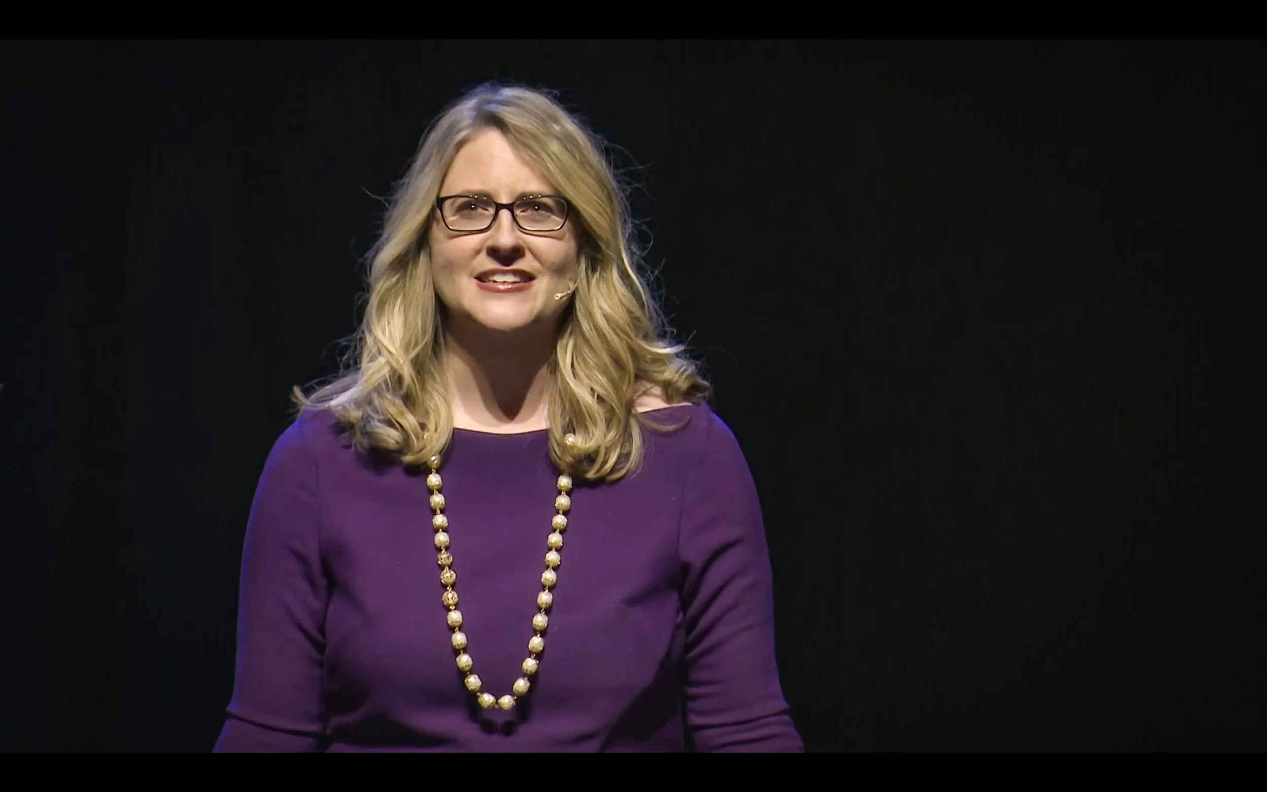
TED Talk
How Your Brain Responds to Stories, and Why They're Crucial for Leaders. 2.25M+ views.